 By Editorial Team
In the professional hair removal business, if your brand isn’t evolving, it’s falling behind. A major waxing provider just rolled out a visual identity refresh, and it’s a smart play to keep clients happy and coming back. The whole idea is to refine the brand’s look and seriously upgrade the in-studio experience for everyone. This move shows they’re paying attention to what clients want in 2026: comfort, and a kind of quiet, simple sophistication. So what’s this new look actually mean for your next appointment?
Key Takeaways
- The new visual identity uses a refined color palette, think calming blues and soft neutrals, to make the studio atmosphere feel more serene.
- New design elements focus on clean lines and a minimalist look, which helps reduce visual noise and makes the space feel more hygienic.
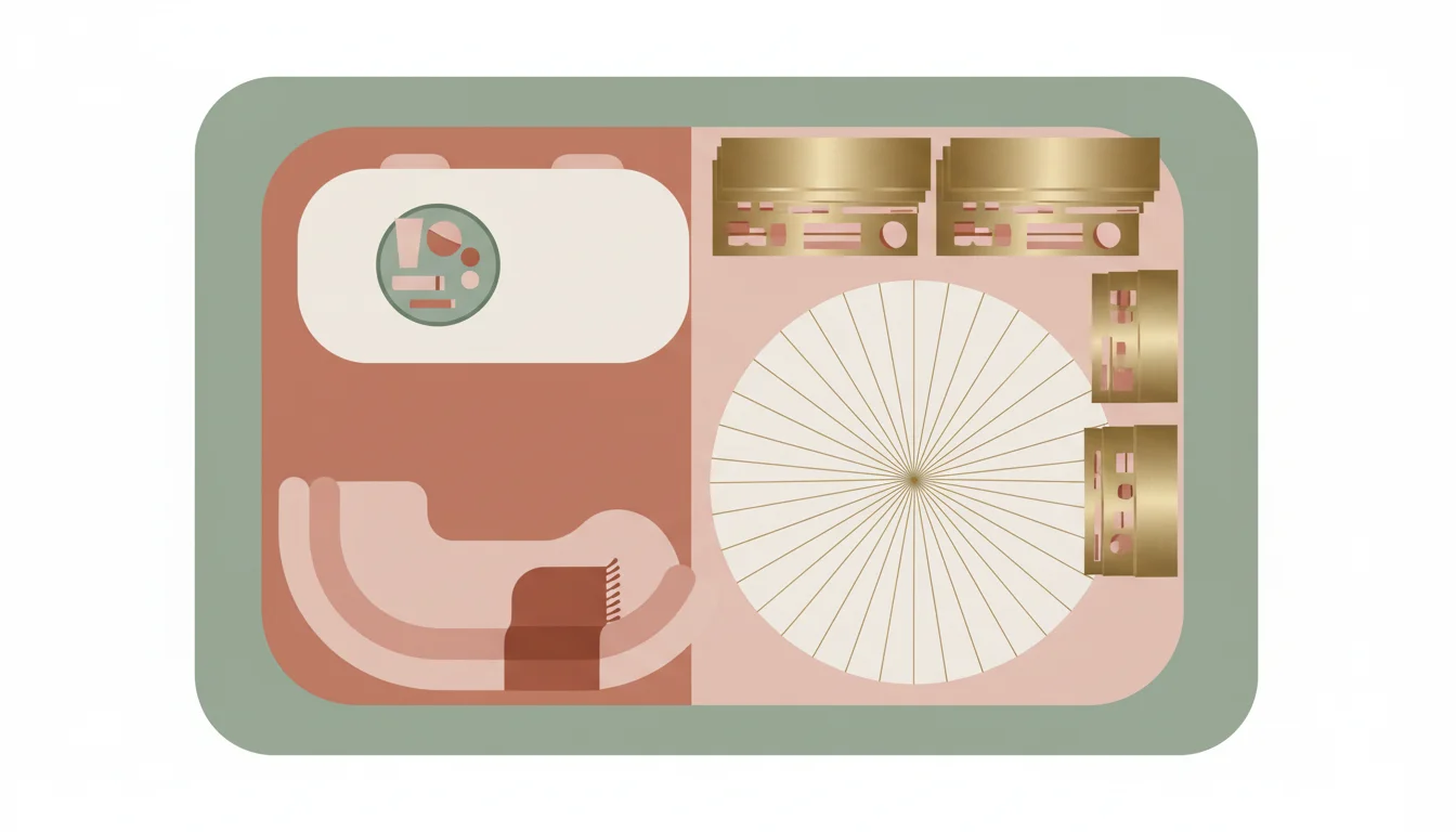
- Updated studio layouts are coming, designed to improve client flow and privacy with specific areas for consultation, the service itself, and post-wax care.
- This brand refresh isn’t just for the physical studios. You’ll see it in a much more intuitive online booking system and a cleaner website design.
- You should start seeing a much more consistent look and feel across all studio locations, from the front desk to the treatment rooms, for a unified experience.
The Evolution of Aesthetic: More Than Just a New Logo
A real brand refresh re-evaluates how a company presents itself everywhere, from the paint on the reception walls to the font on your appointment reminder. For a waxing service, this means thinking about every single detail that shapes the client’s experience. The goal is to build a cohesive feeling that connects with people, whether they’ve been coming for years or are just thinking about booking. By 2026, clients are sharp. They look for brands that deliver a great service inside an environment that feels deliberate and well-designed.
This particular refresh is built around a color palette of calming blues, soft grays, and warm neutrals. It’s a big shift away from the high-energy colors you might have seen before and toward something that feels more like a curated wellness retreat than a typical spa day. This isn’t just a random choice. A 2025 report from the Global Wellness Institute (GWI) noted that people are putting a higher value on environments that promote mental calm, even when they’re just running errands. This color strategy is a direct response to that, aiming to dial down any pre-waxing jitters and just help you relax.
Beyond the colors, the new identity brings in cleaner lines and a more minimalist design philosophy. This refines the brand’s personality by cutting out the noise. Visual clutter is distracting, and for a service like waxing where precision and hygiene are everything, a simplified look directly reinforces a feeling of cleanliness and professionalism. When you walk into a space where every object and finish seems to have a purpose, it sends a clear message. The choice of materials backs this up, favoring natural textures and simple finishes that all contribute to a feeling of calm, clean control.
Enhancing the Studio Experience: From Arrival to Departure
A visual identity refresh has to change how the physical studio actually works for the client. The whole point is to make the journey, from the moment you walk in to the moment you leave, feel better. This refresh concentrates on a few key zones inside the studio to make that happen.
Thoughtful Reception and Waiting Areas
The first impression sets the tone for the entire appointment. The updated design creates reception areas that feel welcoming but are also incredibly efficient. Seating is being reconfigured to give you more personal space instead of cramming everyone together. Lighting is also a big part of this, with a move to softer, more diffused light instead of the harsh fluorescents you might be used to. This makes the whole area feel more inviting and signals that you’re in a place focused on personal, relaxed service. They’re also rolling out digital check-in kiosks with the new branding, which speeds up the arrival process and cuts down on paperwork. It’s a practical change that makes a real difference when you’re in a hurry.
Discover the smoothest way to stay hair-free
Expert waxing that leaves you smooth for weeks. Find a top-rated studio near you.
Find a Wax Center Near You →Optimized Treatment Rooms
The actual service is what you’re there for, and the treatment rooms are getting a major upgrade. The new visual identity is applied here with updated decor that matches the calming feel of the reception area, think subtle changes to wall colors, better linens, and a more organized presentation of tools and products. The goal is to make the room feel like a personal sanctuary where you can feel totally comfortable. They’re also focusing on privacy with better soundproofing and smarter room layouts. I’ve always said the environment is just as much a part of the service as the wax itself. A clean, quiet, and nice-looking room does a lot to reduce a client’s anxiety.
Post-Service Comfort and Care
The appointment isn’t over just because the waxing is. The brand refresh also changes the post-service experience, whether that’s a dedicated area to get ready or just how aftercare products are presented. The packaging for their own aftercare line will now have the new minimalist look, which reinforces the brand’s commitment to quality. Information on post-wax care is also getting a redesign to be clearer and easier to understand, so you leave feeling confident about what to do next. This kind of attention to the entire client journey is what makes a brand refresh actually work.
| Aspect | Previous Studio Experience | Refreshed Studio Experience (2026) |
|---|---|---|
| Color Palette | Lively, energetic tones | Calming blues, soft neutrals, warm grays |
| Design Aesthetic | More decorative, sometimes cluttered | Clean lines, minimalist, purposeful elements |
| Waiting Areas | Standard waiting rooms | More personal space, diffused lighting, digital check-in |
| Treatment Rooms | Standard decor | Consistent calming aesthetic, improved soundproofing, privacy focus |
| Digital Experience | Standard online booking | More intuitive online booking, cleaner website interface |
| Consistency | Variable across locations | Enhanced consistency across all locations |
Digital Integration: A Unified Online and Offline Presence
In 2026, your digital presence and your physical studio can’t feel like two different companies. This refresh makes a point of extending to the brand’s online world, making sure the experience is consistent whether you’re booking on your phone or walking into a studio. This is how you build trust and make your brand recognizable.
The official website, (waxcenter.com), now has the new visual identity, with the refined color palette, modern fonts, and a much cleaner layout. They’ve simplified the navigation so it’s easier to find service info, locate a studio, or manage your appointments. They put a lot of work into improving the user experience of the online booking system. A clunky booking process is a client-repellent, pure and simple. The new system is intuitive, looks good, and works well on any device, making scheduling completely painless.
A pretty website is useless if the confirmation emails look totally different and the studio has another vibe entirely. Now, all the communication touchpoints, from email newsletters to social media posts, will match the new aesthetic. This consistent visual language across every platform solidifies the brand in a customer’s mind and makes every interaction reinforce the same message of professional, refined care. That level of detail is what makes a service feel premium in a crowded market.
The Impact of a Refreshed Identity on Client Perception
A brand’s look communicates a lot before a single word is spoken, shaping perceptions and expectations that directly affect client loyalty. This refresh is engineered to make clients feel a certain way about the brand.
First, it’s about projecting a stronger sense of professionalism and sophistication. The clean lines and muted colors tell a story of a brand that’s confident, precise, and serious about quality. This is hugely reassuring for a first-time client who might be nervous. A polished, calm environment immediately signals that they’re in capable hands. Second, the focus on calm and comfort directly answers our need for a moment of peace. In our ridiculously busy lives, even a 15-minute waxing appointment can feel like a small escape. The redesigned studios are meant to be just that, a brief retreat where you can feel looked after.
Finally, seeing the same consistent design everywhere, from the website to the treatment room, builds an immense amount of trust. When a brand presents a coherent front, it shows an attention to detail and a real commitment to quality. Clients want predictability from personal care services. This refreshed identity is an investment in making clients feel satisfied and building the brand’s reputation for the long haul. It’s a clear signal that the brand is listening and evolving right along with its clients’ needs.
Maintaining Consistency: The Key to a Successful Refresh
The hardest part of a brand refresh isn’t coming up with the design. It’s making it stick across dozens or hundreds of locations. For a big service provider, making sure every single studio lives up to the new visual guidelines is the whole game. If the experience is inconsistent, it just confuses clients and weakens the entire effort.
This means serious training programs for all staff, incredibly detailed brand guideline documents, and regular check-ins to make sure everyone is following the plan. Every detail, from the exact paint code on the wall to how aftercare products are arranged on the shelf, has to be the same. The whole idea is that a client should have the same high-quality, calming experience whether they walk into a studio in Midtown Atlanta or one in downtown Seattle. This operational discipline is what makes a refresh actually work in the real world. Without it, the best design concept falls apart as soon as it hits the floor. You have to make the aesthetic part of the daily routine for every single person on the team.
This new visual identity is a strategic step forward, aligning a major waxing brand with what clients today expect: comfort, class, and a smooth experience from start to finish. By focusing on calming design, better studio flow, and digital consistency, the brand is set up to keep delivering great service in an elevated setting. You’ll be able to see and feel the difference on your next visit.
What are the primary colors used in the refreshed visual identity?
The new palette is built on calming blues, soft grays, and warm neutral tones to create a more serene and sophisticated studio atmosphere.
How does the brand refresh impact the physical studio environment?
The refresh is updating physical studios with cleaner lines, minimalist design, better lighting, and more privacy, all to make the atmosphere feel more tranquil and comfortable for clients.
Will the online booking system be affected by the brand refresh?
Yes, the online booking system has been completely updated to match the new visual identity. It’s now a more intuitive, modern, and responsive interface designed for a much smoother scheduling experience.
What is the main goal of this visual identity refresh?
The main goal is to improve the entire client experience by creating a more sophisticated, calming, and consistent brand presence across all physical studios and digital platforms, reinforcing a feeling of professionalism and comfort.
How will consistency be maintained across multiple studio locations with the new look?
Consistency is maintained through intensive staff training, very detailed brand guideline documents, and regular audits of each location. This ensures every studio adheres to the new standards for a unified brand experience no matter where a client goes.


